Month: August 2025

  • My Top Ten Watercolour Blunders

    I thought I would have a bit of fun and tell you my top 10 watercolour blunders…regularly done by ,me counting down from 10 to 1….

    At 10 ….Not washing my brushes properly before I start painting.

    At 9 …Beginning with a bad sketch that turns into a bad painting !

    At 8…Poor composition !

    At 7….Dipping my brush in the wrong colour !!

    At 6 ….Pulling the paper off with the masking tape!

    At 5 ..keeping going till the colours get muddy

    At 4…not waiting till the masking fluid is dry !!!

    At 3 Not changing the water often enough ….

    At 2… getting a droplet of water on the brush then it drops on the painting ruining a delicate part of the painting like the eye of an animal !

    At 1 ..every watercolourists nemesis dipping the brush in my tea!!!

  • Imposter Syndrome


    I hope as we  grow older we become more confident in our own skin then it’s easier to be ourselves.


    Anyway it’s taken time, for me to acknowledge my work is good., and so for anyone starting out, be proud of your work, never tell people your work is ‘rubbish’, it never is. Time spent painting ( in my opinion )is never wasted. 


    If people see beauty in your work ,that you don’t, then bask in their appreciation

    I wrote these words a while ago now, and I must say it still rings true, however I do now tell people ( if they ask) that I am an artist , and that it’s how I earn my living. 

    I was talking to a lovely lady this week who was picking up a painting from me and we were discussing what we do. She hit the nail on the head when she said she sometimes feels “someday she’ll be found out” that’s exactly how I feel with my painting. I just do what I do and am so amazed that I am able to do this every day .So when people ask for advice or ” do I offer classes?” I almost have to look behind me as I assume they are talking to someone else

    But I am growing daily in confidence and I am happy to share what I know and grateful if people find it useful and interesting

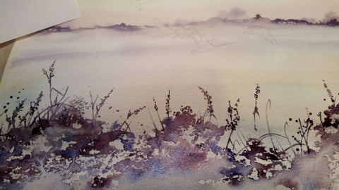
    Last evening I needed to relax and wanted to paint something that reflected my mood and the changing season. I began as always by sketching a scene, this time from my imagination, with some swans flying by gleaned from a photo. 

    The cream circle is a piece of masking tape carefully cut which I am hoping will be the sun . It will preserve the white of the paper against the sky.

    Next the joy of subtle washes ,cerelean blue, yellow ocher and cadmium red mixed with cobalt blue. Some of my old friends that I couldn’t be without them.


    I got lost in the trees and the washes so not too many photos I’m afraid. I use a stronger mixture of cobalt blue and cadmium red to paint the distant trees and vegetation. I love this bit as there is no ‘right’ or ‘wrong’ shape. I can lose myself in the colours and patterns, the only thing is not to let it dry so to avoid hard edges and to try to vary the shapes to keep it interesting.

    Then on to the foreground grasses and twigs, Again cobalt blue and cadmium red , trying to emulate grasses and twigs and not get too fussy in the detail. I splatter, and scratch into the paint. Turn the board upside down etc etc.

    Now finally the swans, flying past. same two colours silhouetted against the sky. I wanted this misty morning scene to have some movement and hopefully some noise. I use a very small series seven brush and take my time, then when that’s done, it’s done.


    Hopefully I’m not found out yet

  • Skies in watercolour

    Here in the Uk we are blessed with so many kinds of weather probably the reason we are obsessed with it. 

    Every time I go outside I look up at the skies with artistic interest 

    No 2 days are ever the same.

    So I wander around with my head in the clouds , or marvelling at the view, wondering how on earth would I paint that?


    If ever a medium was made to paint something then to my mind it is watercolours and skies. You can really let the paint and the water do it’s thing and no-one can tell you it’s not right. I love it.

    My simplest sky though is simply leaving the paper white


    you do sometimes get a white sky, and when the rest of the painting is busy with foliage or other things then why not do just that , leave it.

    Still keeping things simple, you can do a very realistic sky with just one colour. Paynes Grey, 

    Do try to alter the tones and maybe have a draker side and a lighter side, think about the direction you want the clouds to take


    and if you want to add a bit of warmth, yellow ochre works well and creates a very realistic winter sky with the paynes grey.

    Now , because you can with painting lets move to warm summers day, and not a cloud in the sky. Cerulean blue is best for this, slightly yellow at the horizon, then getting more blue towards the top of the page

    The yellow glow on the horizon is made with yellow ochre again. Try and do this graduated wash in one go .

    Now to add some clouds.

    Just leave the paper to do the work for you and add some shadow to the clouds with a purply mixture of cadmium red and cobalt blue.

    More clouds in this one , perhaps it’s a bit cooler.

    Now for a sky which takes up more of the painting

    Con you see I am using the light space between the clouds to focus the eye on the church spire. Remember where you pop your darks and lights.

    Now for an altogether more dramatic sky

    See how it goes from light to dark , I am playing around with colours and shapes.

    Or a very windy day at the beach with many more clouds scudding across the sky


    Finally dusk comes and you can use more yellows and reds in this sky

    The sun is simply the white of the paper, the clouds on the horizon a mix of cadmium red and cobalt blue, and the yellow ochre is warmed up with a bit of cadmium red . 

    Keep things simple but have some fun and try to be spontaneous with your skies as the more you mess with them the muddier they get.

    Look up and see what happens x

  • Refreshingly quirky: Tina M Walker’s gift collection has arrived 🙂

    A little later than expected, but worth the wait! Tina M Walker’s beautiful, quirky gifts have arrived. Fairy houses and toadstools galore! See a few of them below. Order now and make someone smile 🙂 

    Four pink and blue / green toadstool houses stand in a row. The roofs and walls of all four are liberally decorated with simple flower designs have curved windows (two stories, plus a window in the roof) and have curved blue front doors. Tiny toadstool-shaped chimney pots protrude from each roof, and red planters surrounded by stones and with leafy plants growing from each sit between each house. The background is a mottled pale blue.
    A cluster of toadstools with black caps. The cap of the centre toadstool has white spots. They're surrounded by the silhouettes of leafy plants, and a mist lies low on the ground. Above them a silvery full moon shines, and a flock of birds flies across. The background is a mottled beige.
    Two toadstools with long pale stems are twined together. The cap of one of them is red with white spots, the other purple with white spots. Leafy green tendrils twine around and up the pair. The background is a mottled beige colour.

    A pentacle symbol overlaid with green leaves, foliage and white flowers which extend outwards towards the edge of the design. A silvery full moon shines behind and within the circle of the pentacle. The background is deep blue.

    A grey stone Celtic cross, inlaid with Celtic knots, stands in long grass surrounded by red and orange spotted toadstools. Leaves and small white flowers twine upwards and through the cross, and more toadstools appear near the top. There's a mottled blue sky in the background.
    Half of two pink and blue / green toadstool houses standing in a row. The roofs and walls are liberally decorated with simple flower designs have curved windows and have curved blue front doors. Tiny toadstool-shaped chimney pots protrude from each roof, and red planters surrounded by stones and with leafy plants growing from each sit between each house. The background is a mottled pale blue. A cream toadstool house with red and white spotted roof, white curved window, and an oval green door at the bottom. An orange sun rises behind the house against a pale cloudy sky, and a flock of birds flies by.

    Mockup of bag on chair


  • A little foxglove painting to try….

    I don’t know about you but some days my energy levels are at rock bottom. I have been chatting to a few good friends and they too seem to be tired , perhaps it’s the muggy weather or the menopause !! Who knows but we all take a dip in energy from time to time.


    I find a walk in the Devon countryside is always a good idea.


    So in this blog I thought we’d try a smaller more manageable painting ,maybe a hour or two of watercolour will take you away from the world.

    I wanted to show you all again how I go about exploiting watercolour’s extraordinary properties, to make a lovely watercoloury piece. And sometimes something small feels less daunting….


    So I sketched out the foxglove and the bee. Then sprayed the paper with a fine mist, from a water bottle. Then I tapped from my watery brush, droplets of watercolour pinky paint, I used alizarin crimson.

    Then I dapped the bits I didn’t like with a tissue and let the whole thing dry completely 

    Some watercolourists would carry on wet in wet, controlling the paint and buildling up an impression of the flower. I like to go in with some detail to have a contrast between the loose and the tight painting. So I began on the small leaves at the top of the flower. Nice bluey greens

    Then onto the flower itself. It’s amazing how many colours are in one flower. There is blue, orangy red and yellow, as well as pink

    I like to leave parts for the ridges on the flower. Getting darker as I go


    Then to begin on the inside too, building up colours and shadow. I carefully paint around the white spots with a very small brush. If you’re not confident you could use masking fluid.

    See how I am using blues in with the pinks to reflect the colours around the flower

    Then the bee, yellows first then the ‘black’ parts which I really paint in cerulean blue and paynes grey.

    Small brushes and attention to detail.

    Finally the wings and the legs.

    Now I add a hint at the other foxgloves around and add a few finishing touches, now back to the jubilee…..