Month: April 2026

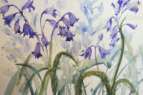
  • In & Out The Dusty Bluebells ( step by step bluebell painting)

    At the risk of being biased, there is nothing quite like an British bluebell. We have a rough and wild  garden and the Spanish bluebells have taken over.   But a short walk down my lane and I can be surrounded by the  real deal, a bank of deciduous trees and lovely native bluebells. 

    The sunshine has returned, the Spring is melting into early summer, sitting in my garden i can pretend ( for a while at least ) that the world is normal. I think in reality we are all anxious about what the coming weeks and months will look like. I don’t know about you, but I can only watch a certain amount of news, I watch the basics then head back to the garden where nature soothes my soul. Painting also does me good, it takes me away to a different place. 

    If you feel inclined then have a go, do something creative and take yourself away from the ‘now’, into a different place. It’s not all about the destination, the journey is just as important, I wanted to create some splishy splashy bluebells , not sure I quite got there, but here’s how I got where I did.

    So firstly find some bluebells and sketch them out.

    Then I spray the dry paper with my spray bottle, and I get quite a large brush, and fill it with the colours of the blue bells. Cobalt blue, cerulean blue, violet, purple, etc. I then tap my brush so the colour falls on the page. Some onto wet paper some onto dry, These are quite weak solutions 

    Then let it dry completely. As you can see it dries much lighter that it is when it is wet.

    Now I will use those colours to paint the bluebells. Start with the lightest colour first. Really look at the flower and see where the light hits it. Use the colours you see, and make sure you go from light to dark.

    Now I can work my way down the flower. The top of the stem is a purple, blue colour but it becomes greener towards the bottom. I like to go carefully, adding the ridges down the bell, creating the roundedness of the shape.

    You can see here how I have merged the blue at the top of the stem into the green, then greeny yellow at the bottom, I also wanted the stem to fade away so I use clean water to merge it into the paper.


    In this final photo of my process you can see how I begin each flower. This is a very weak wash , with cerulean blue, and some violet, then I will drop the darker colours into it. All the time being conscious of where I want the light to remain.

    You can keep going for as long as you want adding more  and more bluebells, Or if you are happy you can stop. Painting puts you in control, well almost ( watercolour does tend to have a life of it’s own). Have fun with it, and forget about the world if only for an hour or 2.


  • Laura Daligan’s wildlife and pagan gifts have arrived 🙂

    Laura Daligan‘s wildlife and pagan gifts are now available 🙂 Beautiful keyrings, hanging ornaments, mugs, tins, and more, all made to order in our studio.

    Scroll down to see beautiful things, or if temptation has already found you, order now

    A woman with long red hair and wearing a sleeveless purple dress stands in front of a red dragon. Both look to the left. A wing wraps around one side, with the head on the other. A stream of fire is emitting from the location of the woman's heart. The overall design colour is red.

    The head of a wolf, looking directly at the viewer. The overall colour of both the wolf and the background are shades of blue, with the exception of yellow/green eyes and flashes of paler fur around the neck. The head of a barn owl, looking directly at the viewer. The background is deep blue.

    The head of a bear looking directly at the viewer. A pale-coloured spiral is coiled at their forehead, opening upwards. Their fur is a mixture of reds, golds and browns, with a pale snout.

    The head and mane of a horse, head facing mostly to the right. The horse is painted entirely in blue apart from a deep brown eye, with two spirals on and above the cheek. The background is blue-green. The head of a red fox looking at an angle towards the viewer, coming into the painting from the right. A pale-coloured spiral is coiled on their forehead. The background is red.

    The head and neck of a stag looking directly at the viewer. The overall colours are deep purples and blues, with lighter peaks at the ends of the antlers.

    A woman with long blue hair stands in front of a blue dragon. Both look to the right. A wing wraps around one side, with the head on the other. The woman holds what appear to be strands of blue ribbon in her outstretched hand. The overall design colour is blue.

    The head of a barn owl, looking directly at the viewer. The background is deep blue.

    A woman with long red hair and wearing a sleeveless purple dress stands in front of a red dragon. Both look to the left. A wing wraps around one side, with the head on the other. A stream of fire is emitting from the location of the woman's heart. The overall design colour is red.

  • Painting not one puffin but two !

    Here in my corner of Mid Devon the seasons are changing , early Spring is giving way to an abundance of wildflowers in the hedgerows and woods. Bluebells and wild garlic are blooming everywhere, and the trees are gaining their leaves.


     While awful news pours out of many countries of the world, nature seems to carry on regardless .I have been coming down with a cold this week and am feeling a little sorry for myself but an hour or two walking amongst the trees and hills of Devon restore a feeling of equilibrium.


    Today’s blog is a tricky one, more of a challenge than some, do  have a go, or just try one puffin for now. Otherwise there are plenty of simpler blogs, there’s one on bluebells I think that may be a bit easier


    I do love painting puffins. The colours are wonderful, the oranges and yellows against the back and white of their bodies 

    I wondered if I could paint a pair of puffins having them interact with the sea and each other seemed to make a more dynamic composition .I sketched them out , mid flight, perhaps fighting over the same fish above the waves.

    I proceeded to paint the lovely orange webbed feet. I start with a first wash of Indian Yellow, then some darker cadmium orange and finally burnt sienna for the darker tones. 


    You can see I put a lot of detail into my puffins.

    I painted the feet on both puffins first.

    Then I moved up the body, I used yellow ochre, a purple made from cadmium red and cobalt blue, all wet in wet, I think there’s some cerulean blue in there too.

    I also painted in some of the black wings with paynes grey.

    Now I can start on the face, creating shadows with the same colours.


    The beak and the eyes, look where the lights are , use blues in the darks to show where the light is hitting the top of the head. 

    The wings are described very loosely, All wet in wet, I paint the whole wing with water then add the ‘ribs’ of the wings in paynes grey while it is still wet. It takes practice to know how wet to have everything. Look lots at what you are trying to paint. Once you understand it it makes more sense to your brush ( if you get what I mean)

    Now I paint the other wing which is cerulean blue and paynes grey

    You can have breaks in this piece if it’s taking up too much concentration, I do find I get tired halfway though, so take breaks, have a wander, or a cuppa.

    The second puffin is painted in a similar order.

    There they are dynamic and free,

    Now the sea is very loose, indigo and cerulean blue, all very wet ( like the sea ) 

    Just hit at the waves try not to be too literal, and you’ll have a wonderful, sea salty painting. 


  • Wildlife and pagan designs from a new artist 🙂

    Beautiful (and very colourful!) wildlife and pagan art by artist Laura Daligan has just arrived, available now as cards, posters and prints, with gifts arriving soon 🙂 

    Laura is a pagan artist and author who resides by the Quantock Hills, where she is continually inspired by the wild beauty of the land. She regularly exhibits her artwork, which has also been featured in numerous books and magazines. Laura’s passion for mythology, faerie lore, animals and history are threads which weave throughout her work, and she explores these liminal themes through paint, poem and song.

    She has a BA (Hons) in Illustration from Falmouth School of Art, a Master’s Degree in Viking Studies, and her first book, ‘A Guide to Reading the Runes – Harness the Wisdom and Power of the Ancient Norse Symbols’ was published in Autumn 2025.

    Order now

    The head of a red fox looking at an angle towards the viewer, coming into the painting from the right. A pale-coloured spiral is coiled on their forehead. The background is red.

    A woman with long blue hair stands in front of a blue dragon. Both look to the right. A wing wraps around one side, with the head on the other. The woman holds what appear to be strands of blue ribbon in her outstretched hand. The overall design colour is blue. A woman with long red hair and wearing a sleeveless purple dress stands in front of a red dragon. Both look to the left. A wing wraps around one side, with the head on the other. A stream of fire is emitting from the location of the woman's heart. The overall design colour is red.

    The head of a barn owl, looking directly at the viewer. The background is deep blue.

    The head and mane of a horse, head facing mostly to the right. The horse is painted entirely in blue apart from a deep brown eye, with two spirals on and above the cheek. The background is blue-green.

    The head of a wolf, looking directly at the viewer. The overall colour of both the wolf and the background are shades of blue, with the exception of yellow/green eyes and flashes of paler fur around the neck. The head of a bear looking directly at the viewer. A pale-coloured spiral is coiled at their forehead, opening upwards. Their fur is a mixture of reds, golds and browns, with a pale snout.

    The head and neck of a stag looking directly at the viewer. The overall colours are deep purples and blues, with lighter peaks at the ends of the antlers.

  • Always learning, always painting

    People ask me a lot how long I have been painting , and the easy answer is as long as I can remember. I never stopped. We all draw and paint as children and then most people just stop , well I carried on and please don’t ask me why?

    I had no great talent , I was certainly no child prodigy but it was just in me I suppose. I loved art at school but when at 16 the ‘O’ level results came out and I had failed art along with most of my other subjects  I  just carried on painting and drawing ( rarely showing a soul) but I kept going and it has given me joy all my adult life.

    So today I thought I would take a look back, I found an old sketch book dated 1992, when I exclusively painted and drew scenery, not a bird or hare to be seen.

    This is a small sketch of the North York Moors

    A Pen and Ink drawing of Staithes.

    I predominantly painted and drew on holiday and was desperate to capture the sea

    Here is an early seascape 

    Then one around 10 years later

    moving through the years

    I got all moody with the sea a few years ago, trying to capture light on the water.

    Then bang up to date with my calmer seascape from yesterday ( April 15th 2026)

    It is so interesting to see how my style changes ,it  gets more fluid, as I get more confident I start to take more risks

    Likewise with landscapes, Around 15 years ago I began going to a watercolour class at my local Arts Centre in Crediton and I learnt new styles, and was dragged kicking and screaming from my comfort zone….

    I discovered Payne’s Grey….

    Then I began to paint Devon Lanes. Something that really interests me and the lanes I see everyday 

    I enjoyed painting flowers as I had a horticultural background too, my first attempt at bluebells….

    Compared with some recent bluebells 

    and many other flowers now too

    Then around 10 years ago someone asked if I ever painted hares….

    My first attempt.

    Yikes should I even show you this !

    which slowly evolved to 

    until they became more like the hares I paint at the moment

    A similar metamorphosis occurs with owls

    From a very early attempt….

    through different stages

    to more recent owls…

    I do continue to learn and evolve, try new things and most importantly enjoy my painting, watercolour is a medium which will enchant, frustrate and challenge me to the end of my days

    They say never throw away a painting ( oh but I do, the really terrible ones have to go!! ) but don’t get rid of everything. They show you who you were, how far you’ve come and how far you can go. If painting or drawing give you joy, if they fulfil a creative itch the the joy is as much in the creating as it is in the finished piece.


  • Adding a dark background ( magnolia )

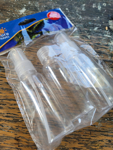
    It’s the small things . I was in Crediton this morning at my local chemist and saw this packet of spray bottles, supposed to be used for travel toiletries, but invaluable to me as a watercolourist.

    They can lose their sprayability ( made up word) over time, so I was just in need of these and there they were.

    Saturday here in Devon was glorious bright sunshine, and so me and my hubby headed for Dartmoor, Belstone in fact, just over ten miles away and were blessed with these amazing views.


    Spring has most definitely sprung, flowers are blooming all over the place.

    As we move through the days , everything seems to be waking up. I made the mistake today of looking outside and seeing the sunshine, so I set off merrily on my walk, without a coat , but ( as my mum would say) there was ‘a nasty cold wind’ which probably kept me walking just a little faster than usual. So no real harm done. 

    However I could still look into the hedgerows and see the small unsung heroes making their debuts . The small ferns beginning to unfurl

    the blackthorn flowers really putting on a show , for those who would watch.

    Here in Devon we are blessed with an abundance of wild primroses and their delicate colour is always a joy to see.

     And now it is the time for magnolia to put on it’s show.


     I couldn’t help but be so impressed by the magnolia blooms that I thought I’d show you my painting 

    First I drew a flower, paying attention to where the petals are and began adding colour.

    Alizaren crimson, makes a nice pink, I also added some cerulean blue. The highlights on the petal are the white of the paper, I added the darker pink by using less water and bought some of the colour up to form veins.

    Next I moved around the flower, painting each petal individually , maybe adding some darker touches once patches were dry, don’t be afraid to go dark. Dark against light adds drama. I made the darkest hue by adding cobalt blue to the crimson.

    Then I painted the branch, just yellow ochre and burnt umber.


    Now the background, the bit that scares us !!!


    If you don’t want a background that’s fine too.

    I painted an under colour of yellow 

    then let that dry, while I mixed greens reds and blues, then I sploshed that around, adding the darkest tones near the whitest parts of the flower. 

    I also splashed on some clean water to create watermarks.


    Then I went in with another layer, going really dark behind the flower. This layering of colour stops the background looking too flat, experiment and have a go. Add warmer colours or cooler colours, but if it looks wrong in your mixing pan , don’t add it. It will look wrong on the paper.


    There a beautiful magnolia flower, and the frost can’t touch this one !

  • Different watercolour skies

    Here in the Uk we are blessed with so many kinds of weather probably the reason we are obsessed with it. 

    Everyday I go my morning walk and look up at the skies with artistic interest 

    No 2 days are ever the same.

    So I wander around with my head in the clouds , or marvelling at the view, wondering how on earth would I paint that?

    I thought it was time to  take a look at skies. If ever a medium was made to paint something then to my mind it is watercolours and skies. You can really let the paint and the water do it’s thing and no-one can tell you it’s not right. I love it.

    My simplest sky though is simply leaving the paper white


    you do sometimes get a white sky, and when the rest of the painting is busy with foliage or other things then why not do just that , leave it.

    Still keeping things simple, you can do a very realistic sky with just one colour. Paynes Grey, 

    Do try to alter the tones and maybe have a darker side and a lighter side, think about the direction you want the clouds to take


    and if you want to add a bit of warmth, yellow ochre works well and creates a very realistic winter sky with the paynes grey.

    Now , because you can with painting lets move to warm summers day, and not a cloud in the sky. Cerulean blue is best for this, slightly yellow at the horizon, then getting more blue towards the top of the page

    The yellow glow on the horizon is made with yellow ochre again. Try and do this graduated wash in one go .

    Now to add some clouds.

    Just leave the paper to do the work for you and add some shadow to the clouds with a purply mixture of cadmium red and cobalt blue.

    More clouds in this one , perhaps it’s a bit cooler.

    Now for a sky which takes up more of the painting

    Con you see I am using the light space between the clouds to focus the eye on the church spire. Remember where you pop your darks and lights.

    Now for an altogether more dramatic sky

    See how it goes from light to dark , I am playing around with colours and shapes.

    Or a very windy day at the beach with many more clouds scudding across the sky


    Finally dusk comes and you can use more yellows and reds in this sky

    The sun is simply the white of the paper, the clouds on the horizon a mix of cadmium red and cobalt blue, and the yellow ochre is warmed up with a bit od cadmium red . 

    Keep things simple but have some fun and try to be spontaneous with your skies as the more you mess with them the muddier they get.

    Look up and see what happens  and Happy Easter x