Category: Uncategorised

  • Sharing my techniques, a seascape

    Sharing my techniques, a seascape

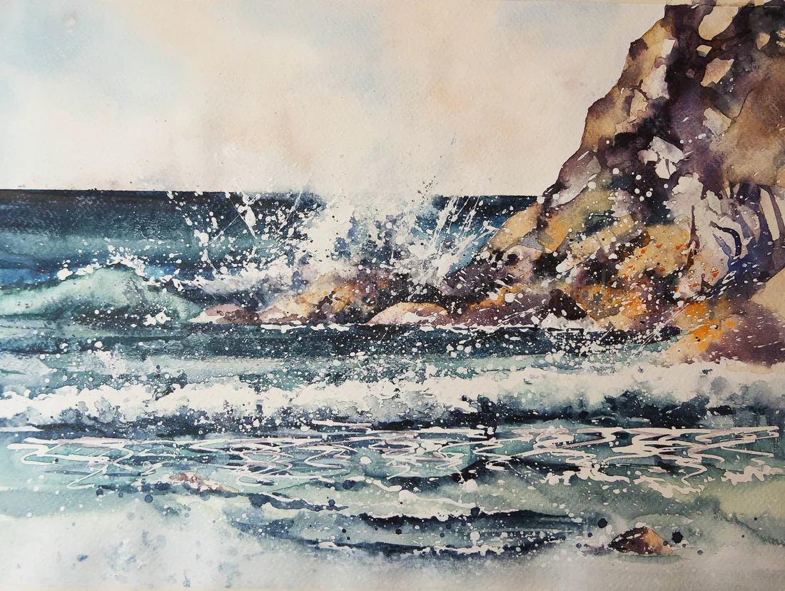
    I spend a lot of time visiting galleries and looking at other people’s art. I got chatting to an artist and finally admitted that ‘ yes I did a bit of painting too’, after chatting about styles and mediums he asked how I made a living , I talked about sales, cards, prints, and social media, then mentioned my blog….”oh no” he said ” you must never give away your secrets ” . I have thought about what he said since then and come to this conclusion. I love to paint and I love to share what I know , if I can inspire others to have a go then I am very happy, I don’t want them to copy everything I do but I know from bitter experience how frustrating it is to be ‘stuck’ and we all need a little ‘leg up’ now and again to get us going again. So totally disregarding his advice here is as detailed a blog as I have ever written on painting this seascape, I ,by no means know all there is to know about painting, but this is where I am with the sea just now. Firstly I draw a simple sketch I use a ruler to get the horizon line right And when not sitting by the sea i use a photo Next I use a piece of masking tape. I try and take some of the stickiness off it by sticking and un-sticking it to my trousers a few times, Then I stick it below the horizon line Now I can paint the sky without worrying about it going into the sea. I used cerulean blue, and some yellow ochre, with a touch of cad.red, also some purpley colour with cobalt blue and cad. red. It is a very subtle sky When the sky was dry I applied masking fluid, I splattered it with a toothbrush too, look where you want to retain the white, or where the foam is, try to ‘paint’ with the masking fluid, so it looks more natural when you remove it. I use colour shapers to apply masking fluid I missed out a lot of the crashing wave bit as I knew it was large enough to paint around. Then  stuck some masking take above the horizon line so I could paint the sea I used my darkest colours in the furthest part of the sea. I used indigo, cerulean blue phthalo blue, turquoise, veridian  and played around with the colours.Have some fun and don’t be afraid of your painting. The more you do the more confident you’ll be I am working my way down the paper, painting around the foam , and looking for lights and darks. These are what make the painting sing I think, you need contrast and interest. There are real shadows in the sea if you look closely I also turn the painting upside down , so the darks run into the corners of the waves , add colour and shadow as you go. I use my fingers to rub the paint in and create softer edges Now for the rocks I don’t like to use brown, I use yellow ochre, with purples and blues for the shadows. I also splatter some orange onto the painting for the lichen and seaweedy stuff on the rocks. Again look for shadows and try to be random and loose. If it looks good ,leave it , rocks are fun to paint Now I have nearly filled in the whole of the paper , but it needs more impact,. I add shadows to the foam behind the rocks again using my fingers and splashing and spraying the paint around. Don’t be afraid to get messy. Then the wave in front of the rocks needs dark underneath and shadows to make it come ‘alive’. Add different tones of blue and green , make your painting as dynamic as you dare Behind the rock where the spray is, there are lights and darks too Now I walk away for a bit and let it settle , once dry, I rub off the masking fluid with a rubber, and see where I am Finally it is a case off adding the finishing touches, breaking up lines that are too hard, adding dark tones. Splashing and splattering some white acrylic until i am done Maybe i have gone too far ( knowing when to stop is a real skill in painting) However a damp cloth and some clean water can get rid of some unwanted marks and my seascape is done, I always want to do better , end up with perfection, but I know I never will. Sharing my work, and learning from others is such a joy , I hope those who want to have a go at painting the sea too Have fun x
  • Painting a dandelion clock

    Hi from a very soggy Mid Devon, last week it was so very hot now it is pouring down

    Wow look at that sky , that is definitely one to pop into my archive and use at a later date.


    And while I write the clouds have moved on and it is brighter again


    Dandelion clocks have always fascinated me, amazingly intricate seed heads, very beautiful, and yet hated by so many. Blowing them as youngsters to see what time it is. Now my husband is waging a long standing war with them in our lawn, trying to remove them before they set seed. We both know the dandelions will win, and why not, they provide food for the bees, and they are so pretty.

    Anyway on to the painting , firstly I draw the dandelion clock.

    Then I carefully paint in the detail of the seed head. I also paint the seeds, giving as much detail as I can , using yellow ochre and burnt umber.

    I move around the dandelion.

    Then the small leaves and the stem.

    The contrast between lights and darks makes the painting ‘pop’ .

    Now to get out the masking fluid and a paper clip. I use an un wound paperclip to apply very thin lines of masking fluid to represent the dandelion seeds.

    Then let that dry

    While it is drying I can paint some dandelion leaves.

    And a couple of bees.

    Now to go in with the indigo, be fast and loose and spontaneous, let the paint move around but get darkest around the white seeds, so that they stand out.

    Then add some cling film or food wrap as I think it’s called in the states. leave the whole thing to dry.


    So when it is completely dry, overnight is best. Remove the cling film


    Make sure everything is as you like, maybe touch up some areas if you like and then rub off the masking fluid 


    And voila another dandelion clock to populate the lawn !

    I do hope you are all doing ok, sending healing thoughts and lots of love to anyone who might need them today x

  • Painting the summer

    Good afternoon, thank goodness the temperature’s dropped since the highs of Monday , Tuesday and Wednesday. Here in Devon it didn’t get quite as hot as some places, but it was still too hot for me.


    I managed to do some work in my studio, as in the morning it stays quite cool, but after lunch it became unbearable, so the best plan was to adapt, as I did when I didn’t feel up to painting or on days when I have treatments …I took my work to my sofa, and sat in my cool lounge. 

    Pencil work, is a new found joy, for days when I want to be quieter, and sitting in my house I realise the old builders knew a thing or two ,a house made of cob is generally warm in winter and cold in summer .

    So I hope people in the UK  are cooling down a bit, we’ll all need to adapt, but also lobby for green issues to move up the agenda. Let’s hope we can enjoy the rest of the summer.


    I hope these blogs can provide some light relief ,and some gentle instructions for those who feel inclined to have a go. I hope none of you feel you have to stick rigidly to what I say , I have discovered what I have through trial and lots of error. I have also changed the way I work when I have been told or shown something new, so don’t be afraid of new ideas. Glean what you can from me, and anyone else whose style you like and whose tips are valuable.

     I use winsor and newton paints and bockingford watercolour paper, but I know many other painters who swear by Daniel Smith and Archers , use what suits you. Experiment, be adventurous, and if it works for you then that is all it needs to do.

    , I thought I would revisit a poppy, no reason really except I wanted something bright and cheerful, I love popping that bright red onto the paper, I wanted to keep it loose, and show you how I did it.

    I took a photo

    and printed it off.


    Then I did a quick sketch

    Now I get a fairly big brush and wet the poppy and the surrounding paper

    I do have a plan at this stage, I want to keep the area I am pointing to in the photo as bright as I can, this means using the white of the paper and my lightest colours.

    So as I said I wet the paper

    Really wet it all over

    Now I go in with my lightest colour. A lovely light bright Indian yellow, nice bold strokes.


    With some spots and splatters thrown in.

    You can see from this angle how wet it all is, I take this opportunity to paint the stem, bring the yellow down and add darker greens to the right hand side.

    Now leave it to settle a bit.

    It isn’t completely dry but I can add some cadmium orange, I am now building up the colour in layers , But I want some of the yellow to show through in the finished piece.


    Now I can add my scarlet, how lovely is that, I also let it bleed over the edges. No-one can feel down with such bright colours dripping off their brush

    Sadly when it dries it isn’t as bright, can you see the yellow shining through, and the white of the paper showing through too.

    The more you can play with light and dark the more vibrant the painting will be I think.

    So now I add more red on top of the dry paper.

    Then a bee…( well why not?)

    It has dried lighter again, and you can see the direction of my brush strokes in the flower.

    I now add my darker tones, at the bottom of the flower, the darker purple tone and some indigo against the lightest light to really make it stand out. These are my artistic decisions, you might not like them or want them in your work, you do what feels right for you.

    Then I leave it all overnight.


    It give some space between me and the painting when I come back in the morning I can decide if I need to do anything else.

    I decided to add some more red and some gold ink ( my choices again) , I feel it is done, it has brightened up my day and what do you know the sun has come while I have been writing too. Happy Days x
     

  • Beautiful cards from a new artist 🙂

    We have a new artist! Tabitha Macbeth‘s nature designs, sometimes leaning into the surreal, really caught our eye; we hope they catch yours too 🙂

    “Working primarily with chalk pastels and pencils, I aim to convey a strong sense of feeling and atmosphere. I enjoy the process of storytelling as well as the immediacy of drawing from life, especially nature. Often using surreal elements to communicate a sense of inner life, there is an ethereal and mystical quality to my work.”

    Scroll down to view Tabitha’s beautiful art, or order now.  

    A giant orange cat, so large that it covers the width of three fields, lies sleeping, head on paws, in a landscape of fields and hedgerows with gentle hills beyond. A small thatched cottage, smoke rising from one chimney, is nestled in a large garden in front of the cat.

    Dartmoor Dreaming

    Arrival

    A brown hare sits in grass, ears upright, beneath a much larger orange/yellow flower hanging down from a long stem like a lamp. The hare and surroundings appear to be lit by the flower. The sky is shades of deep blue with sweeps of pale cloud.

    By the Light of a Flower

    A rabbit stands, slightly crouched, while white butterflies fly above them. The overall colour is shades of green.

    Rabbit with Butterflies

    A child with long hair sits, arms out-scretched and eyes closed, on the back of a giant black cat as it leaps across a landscape of orange hills, swirly clouds and blue skies. A crescent moon and stars sparkle within the body of the cat.

    Cat Beginning

    A grey heron sits facing to the left in long grass on the banks of a wide river. Branches dangle down from above, and the sun illuminates the river, vegetation, and the outline of the heron, making them appear to glow. Overall colours are shades of green and brown.

    Heron at Fisher’s Pond

  • Here’s something that took me ages to work out… ( waves)

    I thought about what to put in my blog this week and, I thought I would start a small series of blogs about some very simple techniques. They took me a while to work out but  made life much simpler for me as a watercolorist. I must admit most things seem complicated until you’re shown them and then you think, oh gosh, why didn’t I think of that?

    Today I’m going to do a very short blog on painting a wave. OK, as you can see. I’ve started off with a line of. Cerulean Blue., with a bit of indigo mixed in.

    Then I painted another line underneath it. I’m using a dry brush so that you can see some of the paper coming through, but that’s not essential.


    Then I get some white acrylic. I put this on when When the paint underneath was a bit wet and that was a mistake. You can see it bleeding into the paint.

    This is the white acrylic that I use, but I think any white acrylic would be fine.

    So moving on. I add my white acrylic. And then underneath the white acrylic I paint with a very very dark line of Indigo. Can you see that this creates the shadow under the wave?

    And then I wet my brush and I blend that dark. So that. It seems as if the wave is curling over. 

    You can add some splatters and splots to show the wildness of the water, look at as many waves as you can to get a feel for them 


    I promise you. That if you paint waves like this in the distance. You’d never need to paint waves any other way.

    And where you leave little crests of white, which was the paper. If you just darken underneath again, you get a wave.

    You can put these waves into larger seascapes, 

    I hope this saves you a lot of time and effort that it  took me to work it out.I think all painting is a form of magic, and once you know some of the short cuts you can go on to create your own magic 


  • A small foxglove painting to try

    So in this blog I thought we’d try a smaller more manageable painting ,maybe a hour or two of watercolour will take you away from the world.

    I wanted to show you all again how I go about exploiting watercolour’s extraordinary properties, to make a lovely watercoloury piece. And sometimes something small feels less daunting….


    So I sketched out the foxglove and the bee. Then sprayed the paper with a fine mist, from a water bottle. Then I tapped from my watery brush, droplets of watercolour pinky paint, I used alizarin crimson.

    Then I dabbed the bits I didn’t like with a tissue and let the whole thing dry completely 

    Some watercolourists would carry on wet in wet, controlling the paint and building up an impression of the flower. I like to go in with some detail to have a contrast between the loose and the tight painting. So I began on the small leaves at the top of the flower. Nice bluey greens

    Then onto the flower itself. It’s amazing how many colours are in one flower. There is blue, orangy red and yellow, as well as pink

    I like to leave parts for the ridges on the flower. Getting darker as I go


    Then to begin on the inside too, building up colours and shadow. I carefully paint around the white spots with a very small brush. If you’re not confident you could use masking fluid.

    See how I am using blues in with the pinks to reflect the colours around the flower

    Then the bee, yellows first then the ‘black’ parts which I really paint in cerulean blue and paynes grey.

    Small brushes and attention to detail.

    Finally the wings and the legs.

    Now I add a hint at the other foxgloves around and add a few finishing touches.


  • Oracle Decks – Blue Angel Publishing/Llewellyn Publications

    Beautiful full color decks available on Amazon


  • In & Out The Dusty Bluebells ( step by step bluebell painting)

    At the risk of being biased, there is nothing quite like an British bluebell. We have a rough and wild  garden and the Spanish bluebells have taken over.   But a short walk down my lane and I can be surrounded by the  real deal, a bank of deciduous trees and lovely native bluebells. 

    The sunshine has returned, the Spring is melting into early summer, sitting in my garden i can pretend ( for a while at least ) that the world is normal. I think in reality we are all anxious about what the coming weeks and months will look like. I don’t know about you, but I can only watch a certain amount of news, I watch the basics then head back to the garden where nature soothes my soul. Painting also does me good, it takes me away to a different place. 

    If you feel inclined then have a go, do something creative and take yourself away from the ‘now’, into a different place. It’s not all about the destination, the journey is just as important, I wanted to create some splishy splashy bluebells , not sure I quite got there, but here’s how I got where I did.

    So firstly find some bluebells and sketch them out.

    Then I spray the dry paper with my spray bottle, and I get quite a large brush, and fill it with the colours of the blue bells. Cobalt blue, cerulean blue, violet, purple, etc. I then tap my brush so the colour falls on the page. Some onto wet paper some onto dry, These are quite weak solutions 

    Then let it dry completely. As you can see it dries much lighter that it is when it is wet.

    Now I will use those colours to paint the bluebells. Start with the lightest colour first. Really look at the flower and see where the light hits it. Use the colours you see, and make sure you go from light to dark.

    Now I can work my way down the flower. The top of the stem is a purple, blue colour but it becomes greener towards the bottom. I like to go carefully, adding the ridges down the bell, creating the roundedness of the shape.

    You can see here how I have merged the blue at the top of the stem into the green, then greeny yellow at the bottom, I also wanted the stem to fade away so I use clean water to merge it into the paper.


    In this final photo of my process you can see how I begin each flower. This is a very weak wash , with cerulean blue, and some violet, then I will drop the darker colours into it. All the time being conscious of where I want the light to remain.

    You can keep going for as long as you want adding more  and more bluebells, Or if you are happy you can stop. Painting puts you in control, well almost ( watercolour does tend to have a life of it’s own). Have fun with it, and forget about the world if only for an hour or 2.


  • Laura Daligan’s wildlife and pagan gifts have arrived 🙂

    Laura Daligan‘s wildlife and pagan gifts are now available 🙂 Beautiful keyrings, hanging ornaments, mugs, tins, and more, all made to order in our studio.

    Scroll down to see beautiful things, or if temptation has already found you, order now

    A woman with long red hair and wearing a sleeveless purple dress stands in front of a red dragon. Both look to the left. A wing wraps around one side, with the head on the other. A stream of fire is emitting from the location of the woman's heart. The overall design colour is red.

    The head of a wolf, looking directly at the viewer. The overall colour of both the wolf and the background are shades of blue, with the exception of yellow/green eyes and flashes of paler fur around the neck. The head of a barn owl, looking directly at the viewer. The background is deep blue.

    The head of a bear looking directly at the viewer. A pale-coloured spiral is coiled at their forehead, opening upwards. Their fur is a mixture of reds, golds and browns, with a pale snout.

    The head and mane of a horse, head facing mostly to the right. The horse is painted entirely in blue apart from a deep brown eye, with two spirals on and above the cheek. The background is blue-green. The head of a red fox looking at an angle towards the viewer, coming into the painting from the right. A pale-coloured spiral is coiled on their forehead. The background is red.

    The head and neck of a stag looking directly at the viewer. The overall colours are deep purples and blues, with lighter peaks at the ends of the antlers.

    A woman with long blue hair stands in front of a blue dragon. Both look to the right. A wing wraps around one side, with the head on the other. The woman holds what appear to be strands of blue ribbon in her outstretched hand. The overall design colour is blue.

    The head of a barn owl, looking directly at the viewer. The background is deep blue.

    A woman with long red hair and wearing a sleeveless purple dress stands in front of a red dragon. Both look to the left. A wing wraps around one side, with the head on the other. A stream of fire is emitting from the location of the woman's heart. The overall design colour is red.

  • Painting not one puffin but two !

    Here in my corner of Mid Devon the seasons are changing , early Spring is giving way to an abundance of wildflowers in the hedgerows and woods. Bluebells and wild garlic are blooming everywhere, and the trees are gaining their leaves.


     While awful news pours out of many countries of the world, nature seems to carry on regardless .I have been coming down with a cold this week and am feeling a little sorry for myself but an hour or two walking amongst the trees and hills of Devon restore a feeling of equilibrium.


    Today’s blog is a tricky one, more of a challenge than some, do  have a go, or just try one puffin for now. Otherwise there are plenty of simpler blogs, there’s one on bluebells I think that may be a bit easier


    I do love painting puffins. The colours are wonderful, the oranges and yellows against the back and white of their bodies 

    I wondered if I could paint a pair of puffins having them interact with the sea and each other seemed to make a more dynamic composition .I sketched them out , mid flight, perhaps fighting over the same fish above the waves.

    I proceeded to paint the lovely orange webbed feet. I start with a first wash of Indian Yellow, then some darker cadmium orange and finally burnt sienna for the darker tones. 


    You can see I put a lot of detail into my puffins.

    I painted the feet on both puffins first.

    Then I moved up the body, I used yellow ochre, a purple made from cadmium red and cobalt blue, all wet in wet, I think there’s some cerulean blue in there too.

    I also painted in some of the black wings with paynes grey.

    Now I can start on the face, creating shadows with the same colours.


    The beak and the eyes, look where the lights are , use blues in the darks to show where the light is hitting the top of the head. 

    The wings are described very loosely, All wet in wet, I paint the whole wing with water then add the ‘ribs’ of the wings in paynes grey while it is still wet. It takes practice to know how wet to have everything. Look lots at what you are trying to paint. Once you understand it it makes more sense to your brush ( if you get what I mean)

    Now I paint the other wing which is cerulean blue and paynes grey

    You can have breaks in this piece if it’s taking up too much concentration, I do find I get tired halfway though, so take breaks, have a wander, or a cuppa.

    The second puffin is painted in a similar order.

    There they are dynamic and free,

    Now the sea is very loose, indigo and cerulean blue, all very wet ( like the sea ) 

    Just hit at the waves try not to be too literal, and you’ll have a wonderful, sea salty painting.